
Starbucks
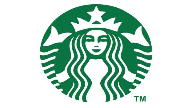
Ever wondered while you were ordering your chai latte why on Earth did Starbucks chose a mermaid for its logo? The founders named the company after a character in the nautical novel “Moby-Dick” and keen to push the seafaring theme, opted for a two-tailed siren design based on a 16th-century Norse woodcut.
Amazon.com
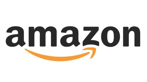
It may be glaringly obvious to some people, but it’s easy to miss the meaning behind the arrow that underscores the Amazon logo. The arrow, in the shape of a smile, points from A to Z to imply that the company is a friendly, welcoming one-stop-shop that stocks everything money can buy.
Sony Vaio
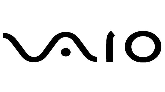
One for the math geeks, Sony’s Vaio logo is a masterclass in clever icon design but its meaning may have gone over your head. The ‘V’ and ‘A’ form an analog symbol, while the ‘I’ and ‘O’ combine to make a binary digital signal, neatly representing Sony’s transition from analog to digital.
Pepsi
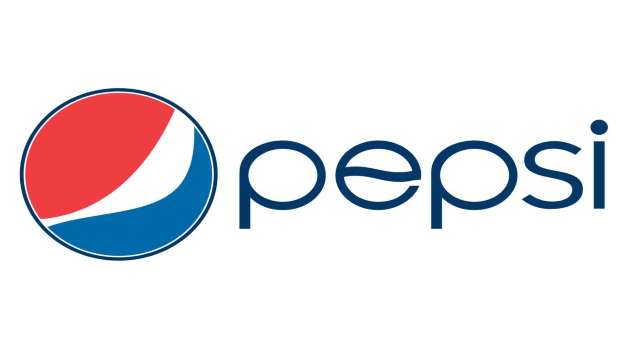
Pepsi’s latest logo, which cost several million dollars to revamp in 2009, may look like a simple asymmetric version of the previous incarnation. However, according to the company it references everything from Feng shui and Renaissance art to the philosopher Descartes and the architect Le Corbusier.
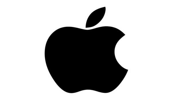
Apple
Several urban myths are still doing the rounds – that the apple is a tribute to science pioneers Sir Isaac Newton and Alan Turing, for example, or represents the fruit from the tree of knowledge in the Bible. In reality, logo designer Rob Janoff doesn’t even remember why he chose the specific shape.
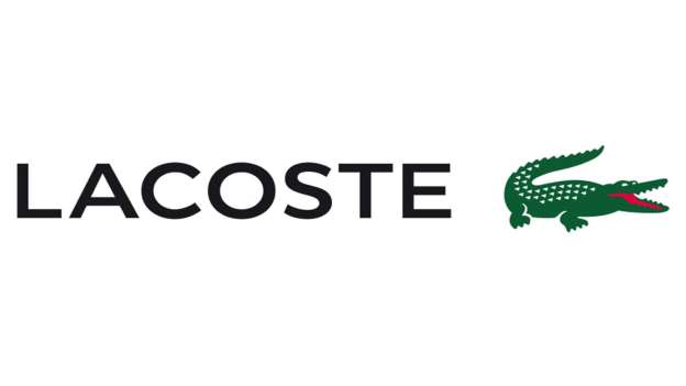
Lacoste
In 1927, world-renowned tennis player and company founder René Lacoste famously wagered for an alligator skin suitcase, and was nicknamed the Alligator by the American press. Translated as the Crocodile by media in his native France, the nickname stuck and the reptile was a natural choice for a logo design when Lacoste launched his first sportswear collection in 1933.
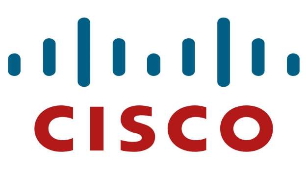
Cisco Systems
Can’t figure out what the vertical lines mean? The clue’s in the name. They form an abstract image of San Francisco’s Golden Gate Bridge. On their way to register the company, the founding team crossed the famous suspension bridge and decided at that moment to name their company after the city and ended up putting the bridge on the logo.
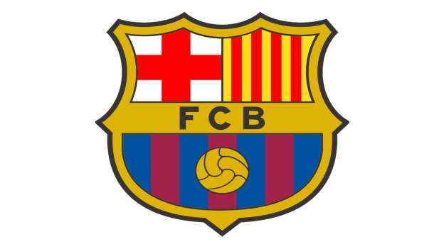
FC Barcelona
The world-class soccer club’s logo is a homage to Catalonia: the logo showcases the red and yellow stripes of the Catalan flag in the top right-hand corner and the red cross of Saint George in the top-left. Saint George. aka Saint Jordi. is the patron saint of Catalonia. The logo also displays the team’s colors and a soccer ball motif.
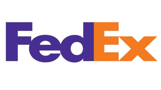
FedEx
A winner of numerous design awards, FedEx’s logo rocks a subtle yet super-clever graphic design trick. The space between the ‘E’ and the ‘x’ forms a forward-pointing arrow, which reflects the company’s dynamic, forward-thinking ethos.
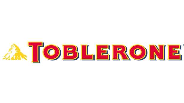
Toblerone
Ever noticed the bear on the Toblerone logo? Neither had we! The image is hidden within the Matterhorn mountain design and represents Bern, the Swiss city in which the chocolate and nougat bar was first produced, which is thought to have been named after a bear.
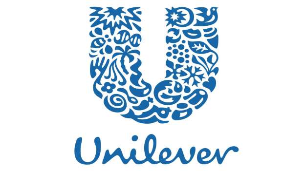
Unilever
The Unilever logo is a letter ‘U’ made up of 24 icons, which each represent a different aspect of the company’s values and goals. For instance, the bee signifies the firm’s pledge to protect the environment, and the heart denotes its commitment to improve people’s health and wellbeing.
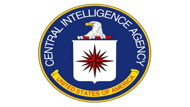
The CIA
This imposing logo features three potent symbols: the all-powerful eagle, which represents the United States, of course; the shield to symbolize protection; and the compass rose with 16 spikes pointing in all directions, which signifies the agency’s global intelligence-gathering capabilities.
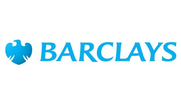
Barclays
The venerable bank’s ‘spread eagle’ emblem dates from the late 17th century when John Freame, one of the forefathers of the institution, hung a sign outside his business in London’s Lombard Street depicting the bird of prey, which symbolizes strength and far-sightedness. In those days most people were illiterate, so pictures were often used on signs instead of text.
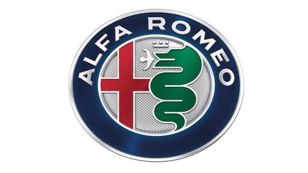
Alfa Romeo
A snake chowing down on a human isn’t exactly the sort of thing you’d expect to see on a car manufacturer’s logo. Alfa Romeo’s bizarre logo, which was created in 1910, depicts the man-eating Biscone serpent as well as a red cross, heraldic symbols strongly associated with the Italian city of Milan, where the car firm was founded.
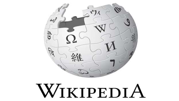
Wikipedia
The world’s No. 1 online encyclopedia has a suitably smart logo: The jigsaw pieces that make up the unfinished globe each feature characters from different writing systems such as the Greek omega and the Latin W. The globe represents Wikipedia’s multilingual character and its huge global reach.
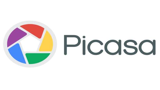
Picasa
You might need to speak a bit of Spanish to work this one out. The primary colors symbol represents the shutter of a camera – that part’s pretty obvious. But if you look more closely you’ll notice the outline of a house. House is ‘casa’ in Spanish, so the logo is a subtle nod to the picture site’s name.
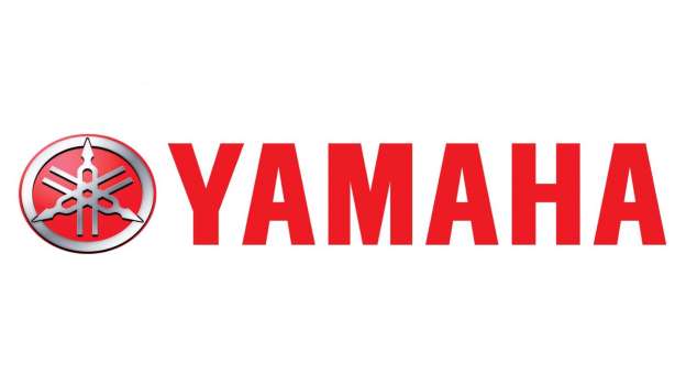
Yamaha
The Japanese corporation makes everything from motorcycles to electronics these days, but Yamaha was established in 1887 as the Nippon Gakki Co., a piano and organ reed manufacturer. Hence the logo, which features three piano tuning forks. The forks represent strong technology, production and sales.
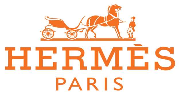
Hermès
Established in 1831, the prestigious fashion house started out in Paris as a riding harness-maker and didn’t sell the handbags, scarves and ties it is now famous for until the 1920s. The logo, created in the 1950s, depicts a horse and antique Duc carriage to celebrate the equestrian roots of the brand.
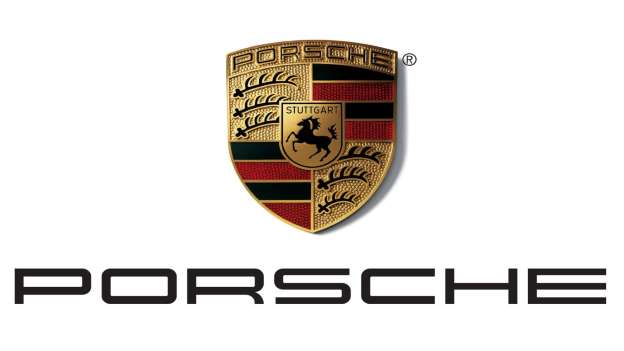
Porsche
Staying with the equestrian theme, Porsche’s instantly recognizable logo depicts a black stallion. Wonder why? The logo is based on the coat of arms of the German city of Stuttgart, where the company is headquartered. The horse takes center stage because the city, which dates back to the year 950, was actually founded as a stud farm.
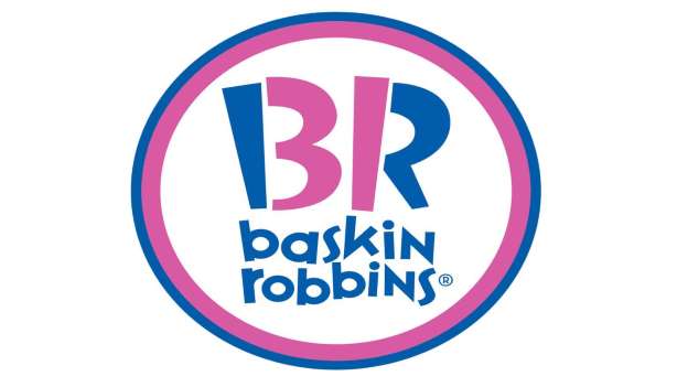
Baskin Robbins
The ice cream franchise is famed for its “31 flavors” slogan, so it’s no wonder the number 31 is hidden in the company logo, within the letters “B” and :R.” Though the logo was redesigned in 2007 to cleverly “hide” the numerals, 31 has always featured on the logo of the company, which was founded in 1953.
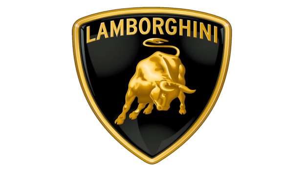
Lamborghini
Founded in 1963 by Ferruccio Lamborghini, the luxury Italian car maker opted for a bull as its logo as Mr. Lamborghini had a bit of a thing for the animals. Born under the sign of Taurus, he was obsessed with bullfighting.
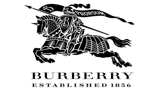
Burberry
The British firm’s waterproof gabardine fabric was revolutionary when it was invented in the late 19th century, and company founder Thomas Burberry wanted a logo that reflected the pioneering ethos of the company. Fittingly, the iconic “Equestrian Knight” was designed in 1902 and boasts a flag emblazoned with the Latin word “Prorsum,” which means forward.
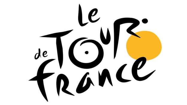
Le Tour de France
Joël Guenoun, the designer of the French cycling race’s new logo, must have been very pleased with himself when he presented the updated design in 2002. If you look at the ‘R’ in ‘Tour’ – you can see that it forms the image of a crouching cyclist, while the orange blob represents the bike.
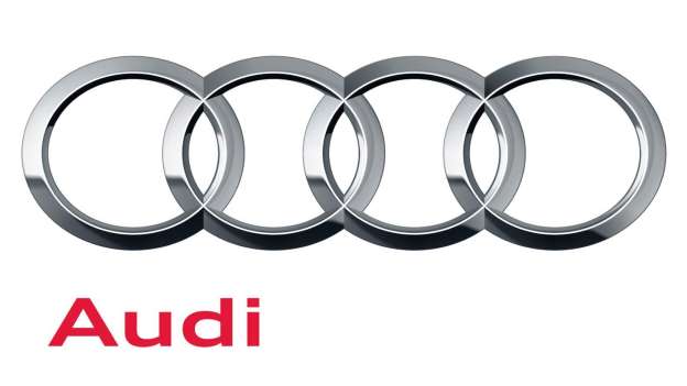
Audi
The interlocking Olympic-style rings on Audi’s famous logo raises the question: What do they mean? The rings actually represent the 1932 merger of the four firms that formed the modern company – Audi, DKW, Horch and Wanderer – and the design was adopted as the new logo during the 1930s.
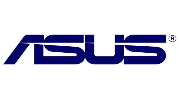
Asus
You may think that the Taiwanese computer company’s logo is simply a good use of futuristic Star Wars-like typography. But the firm had something very specific in mind when it created the lettering. The logo is meant to be shaped like Pegasus, the winged horse from Greek mythology that symbolizes wisdom. Yes, really.
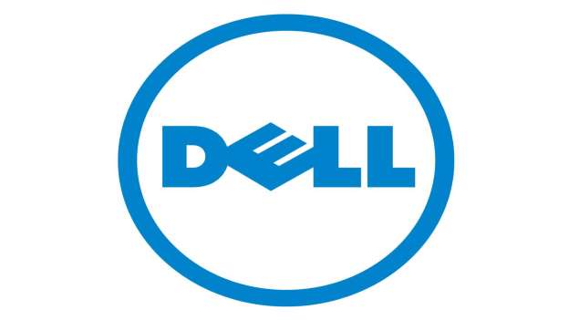
Dell
The Dell logo is a basic affair apart from the slanted ‘E’. The company’s founder Michael Dell started his business with the aim to “turn the world on its ear.” When creatives from design firm Siegel+Gale devised the company logo in 1984, they decided to represent this by slanting the letter ‘E’.
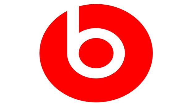
Beats by Dre
Another masterclass in clever logo design, the Beats by Dre logo includes a lower-case ‘b’ that also forms an abstract image of a person listening to the must-have headphones. As simple as you can get but super-effective.
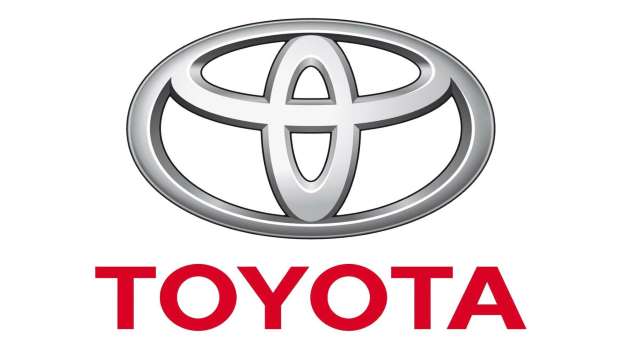
Toyota
The three interlocking oval shapes that make up Toyota’s logo may just look like curvy lines to most people but they actually symbolize the company’s core values. The inner ovals represent the relationship between Toyota and its customer base, while the outer oval “signifies the world embracing Toyota.”
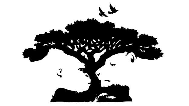
Pittsburgh Zoo
The logo for the Pittsburgh Zoo & PPG Aquarium shows off a similar design technique. Again, if you look at the tree design for longer than a couple of seconds, you’ll notice a gorilla, a lion and a shoal of fish in the white space.
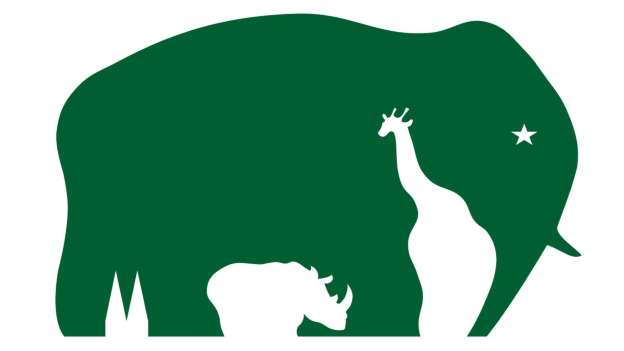
Cologne Zoo
From a distance, this German zoo’s logo resembles an elephant and nothing else. But if you look closer at the design, you can easily pick out a giraffe, rhinoceros and star in the negative space, as well as two triangular shapes that symbolize the twin spires of nearby Cologne Cathedral.